Kyle Jumara
Graphic Designer
Photographer/Videographer
Visual Storyteller
Creating compelling, culturally inspired visuals that unite tradition
& innovation for future global brands.

Experienced graphic designer and visual creator with 10+ years delivering impactful branding, digital, and print design across Japan, the US, and global markets. Skilled in Adobe Creative Suite, Figma, and CMS platforms, I blend artistic vision and technical expertise to produce cohesive visuals—from graphics and marketing materials to photography and video. Known for thriving in fast-paced, multilingual teams, I transform brand guidelines and cultural heritage into engaging content for web, social, and print. With strong attention to detail, project management, and collaboration, I lead creative projects and mentor teams while passion for Japanese culture and design innovation fuels my storytelling.
Graphic Design & Motion
March Int'l
This branding project was created for a Tokyo startup aiming to bridge Japanese culture with the West and attract both local and international clients. The logo features a circle inspired by the Japanese flag, with a smiling face to express approachability. Above and below, the katakana characters “MA” (マ) and “I” (イ) form “March International” and evoke a marching band’s hat and uniform—symbolizing forward movement.

Above and below, the katakana characters “MA” (マ) and “I” (イ) form “March International” and evoke a marching band’s hat and uniform—symbolizing forward movement.The red and blue color palette references both the flag and ocean, emphasizing global connection. The visual identity communicates cultural pride, warmth, and ambition, with the animated logo reinforcing the company’s role as a friendly, international bridge.
Dajare
ダジャレ
Ichigo
イチゴ
"Ichigo," the word for strawberry, can be broken into two parts: "Ichi" and "Go," which correspond to 1 and 5 respectively. In this design, a ladybug with a total of five spots is depicted, with one of them being larger than the others, echoing the numbers one and five.

Dajare/ダジャレ translates to puns. The majority of these designs revolve around wordplay on similar sounding words. The following three designs are all themed around four things.
Hachimitsu
ハチミツ
Similarly, Hachimitsu can be broken down into "Hachi," meaning 8, and "Mitsu," which signifies counting three objects. I've always found it amusing how the word "bee" phonetically mirrors the letter "B" in English, just as "Hachi" does for "8" in Japanese and that "8" looks similar to a "B"


Batta
バッタ
The word "Batta" means grasshopper, closely resembling the loanword "Baata" for butter. Thus, these are Mr. Grasshopper's croissants. To align with the color themes of the three designs, I chose a blueish-green hue (a slight cheat) and orange for the croissant.

Safe Shell App Animations
A collection of custom UI animations designed for the Safe Shell app, featuring my original mascot characters. These animations bring the app’s interface to life and showcase both my creative and technical skills in motion design.

Print Media
Baseline Magazine Mockup

Illustations and branding materials from previous companies and clients. Layout mockup inspired by Baseline magazine, emphasizing the use of simple, repetitive patterns to highlight a diverse array of inspirational artists.

Glitch Calendar
I wanted to create a wall calendar that had individual disposable days similar to a desk calendar. The days of the month are removed from the bottom of the calendar and are displayed backwards as well as upside down.
I chose a "glitch" aesthetic from NES games to coincide with the strange calendar layout.I designed, printed bound and perforated a few of the calendars.


Digital Media & UI/UX
Safe Shell App
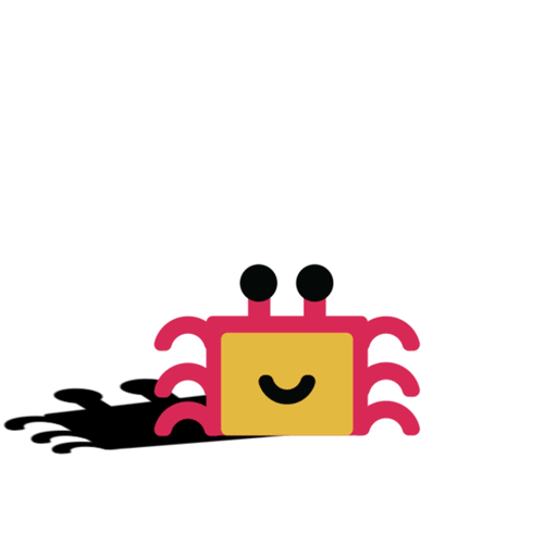
These concept designs were created using Adobe Illustrator, After Effects, and Figma, with 3D modeling completed in Autodesk Maya. The project features a smart device designed specifically for children—engineered to be rugged and compact enough to fit in the small tissue pockets that many young students in Japan carry on their hips. Shaped like a friendly cartoon crab, the device’s design is reflected in the app’s simple and engaging interface. Functionally, the device communicates within close proximity to traffic lights and crosswalks to help prevent children from crossing streets unsafely. The accompanying app includes a feature that allows users to electronically press the crosswalk button, but only when near the crossing, preventing misuse.


This app concept was developed with the goal of blending industry-standard familiarity with a playful, approachable aesthetic. The user interface intentionally avoids realism, favoring a fun look with simple shapes, minimal distractions, and easy-to-use buttons—making it engaging and accessible for children. The design prioritizes clarity and intuitiveness, while multi-language options ensure inclusivity for diverse users. Overall, the app balances professional usability standards with a child-friendly, visually inviting experience.
Photography
A curated gallery showcasing my latest photography—highlighting dynamic landscapes, striking wildlife, and compelling product imagery. Each set displays the original raw image on the left and my refined edit, crafted in Adobe Lightroom and Photoshop, on the right.
Raw


Edit


Video
Safe Shell App
I shot and edited this video in Japan for the Safe Shell kids’ safety app, capturing a busy crosswalk scene. To enhance engagement and brand identity, I integrated the app’s crab mascot, making him stand out as a distinct, cartoony character while still feeling naturally part of the real environment. The crab’s shadow was carefully matched to the sun’s direction for realism, and I used camera tracking to ensure the mascot’s movement aligned with the footage, accounting for camera shake and natural movement. This project showcases advanced compositing, attention to environmental detail, and a balance of playful design with authentic context—all in service of a memorable, app-branded safety message.

Matcha Gotcha
I co-manage a YouTube channel, producing videos that showcase product photography and motion graphics using a home studio setup. I handle all concept development, video recording, studio lighting, editing, motion graphic integration, and content management, while my friend assists with content posting and provides voice recordings. Together, we cover all aspects of channel production—working collaboratively to create and publish engaging shorts and full-length videos across multiple platforms. This experience demonstrates my hands-on expertise in videography, photography, editing, and full media production, alongside strong collaboration and team management in a real-world environment.


Case Studies
Tokyo Creative Club Logo


Objective
I endeavored to craft a captivating logo and establish a brand identity that seamlessly blended with our burgeoning Creative Arts division while staying true to the foundation of our Coding expertise.It was crucial for me to create something recognizable while maintaining a child-friendly appeal. Additionally, I aimed to ensure continuity with the Tokyo Coding Club and stay on brand.Early on I wanted to focus on the two aspects of creative courses (animation and video) we offered while keeping them in harmony. Using the 3 colors that make up an LCD screen kept with the digital aspect. The green leaf shape at the top is a reference to the symbol of Tokyo paying homage to where the company was started.
Outcome
I'm pleased with the finished project; it remained faithful to my initial sketches but underwent a simplification process, all while staying true to our brand identity. Moreover, its appeal resonated positively with others, which was gratifying.
Roll
I joined to pioneer the Creative Arts department and strengthen the company’s brand identity. As Creative Arts Manager, I worked closely with the owner to develop a compelling image that boosted visibility and community recognition. Our success was highlighted in the Tokyo American Club magazine. I also built partnerships with schools and businesses in Tokyo and internationally, expanding our reach.
Haru logo


Objective
I began my creative journey with a series of rough sketches, initially exploring ideas centered around the Haru kanji (春). However, I soon realized that my initial approach, which involved incrementally adding details atop the character, lacked the vitality and balance I was aiming for. Feeling dissatisfied with its lack of cohesion and roundness, I decided to pivot my design strategy.
In my reimagined concept, I centered the design around a sunflower, quite literally revolving around it to create a rounder aesthetic—a departure from my usual style. The sunflower, symbolizing the "sun" at the heart of Haru (春), served as a focal point, radiating the essence of spring. I incorporated additional spring imagery to infuse the design with an authentic "Haru" vibe.
Challenges
The initial iterations of my design were overly intricate, rigid, and perhaps a touch too literal. I desired a more subtle approach, infused with a generous dose of charm. My aim was to create a design that exuded an irresistible cuteness while maintaining broad appeal, even to those who might not immediately notice all the delightful hidden details.
Outcome
I am delighted with the final outcome. While there were numerous minor adjustments made towards the end, the overarching shape and theme remained consistent. Ultimately, I achieved a harmonious balance between simplicity, elegance, and charm. Inspired by the enduring appeal of many iconic logos, I aimed to create a design that offered layers of meaning, inviting viewers to discover more as they studied it further.
Marketing Campaigns
Tokyo Coding Club
Produced a diverse range of marketing materials for Tokyo Coding Club, including both printed and digital assets. Projects encompassed designing cohesive flyers, posters, pitch decks, and catalogs that maintained strong brand identity across all channels. Collaborated with cross-functional teams to deliver visually engaging materials tailored for events, client presentations, B2B partnerships, and internal communications. These deliverables contributed to increased brand awareness, lead generation, and enhanced client engagement.


Kani Tabi &
Safe Shell

These are the branding details and an overview of the Kani Tabi kids device, including the fonts, color palette, shapes, and characters used throughout the brand.
